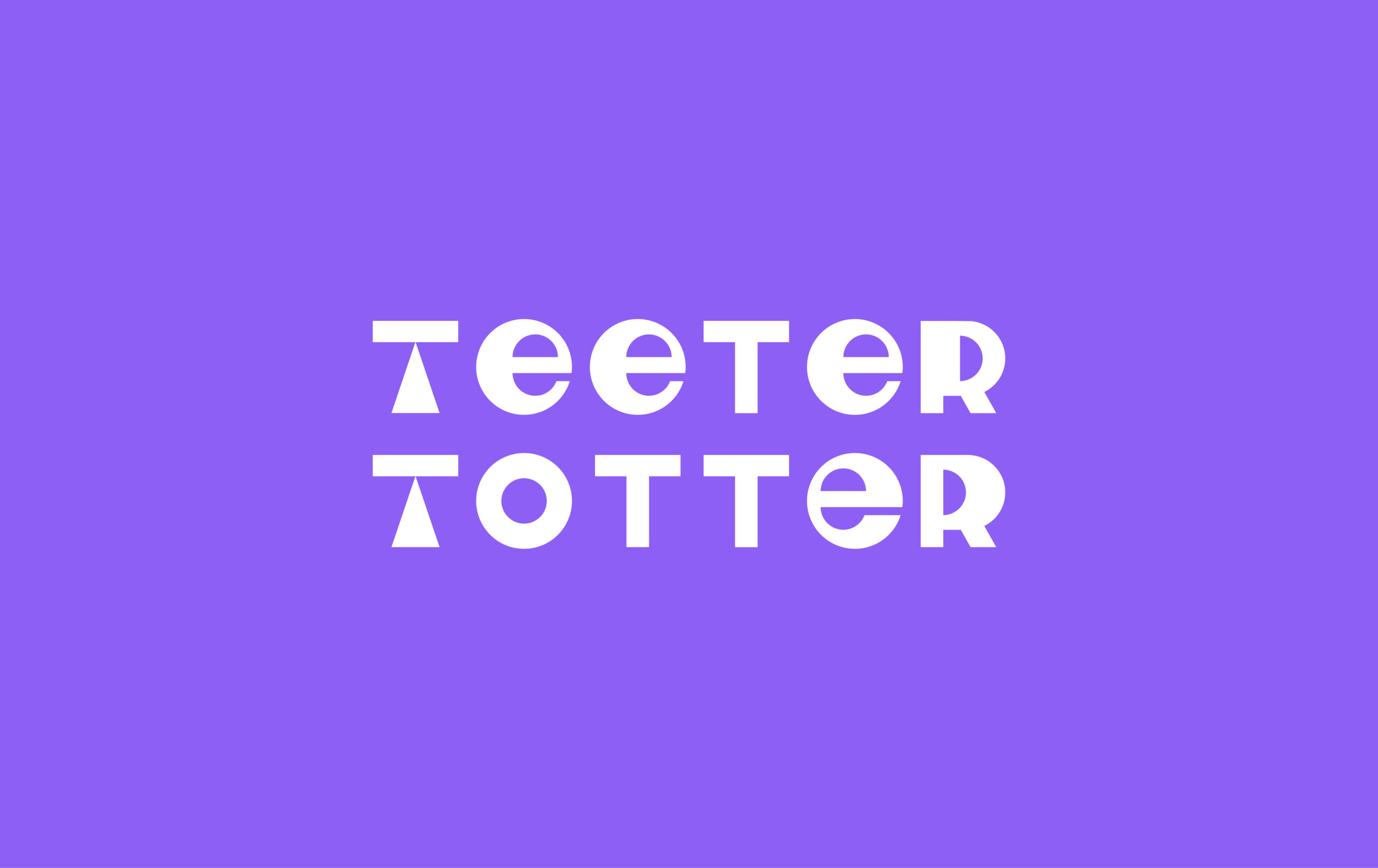
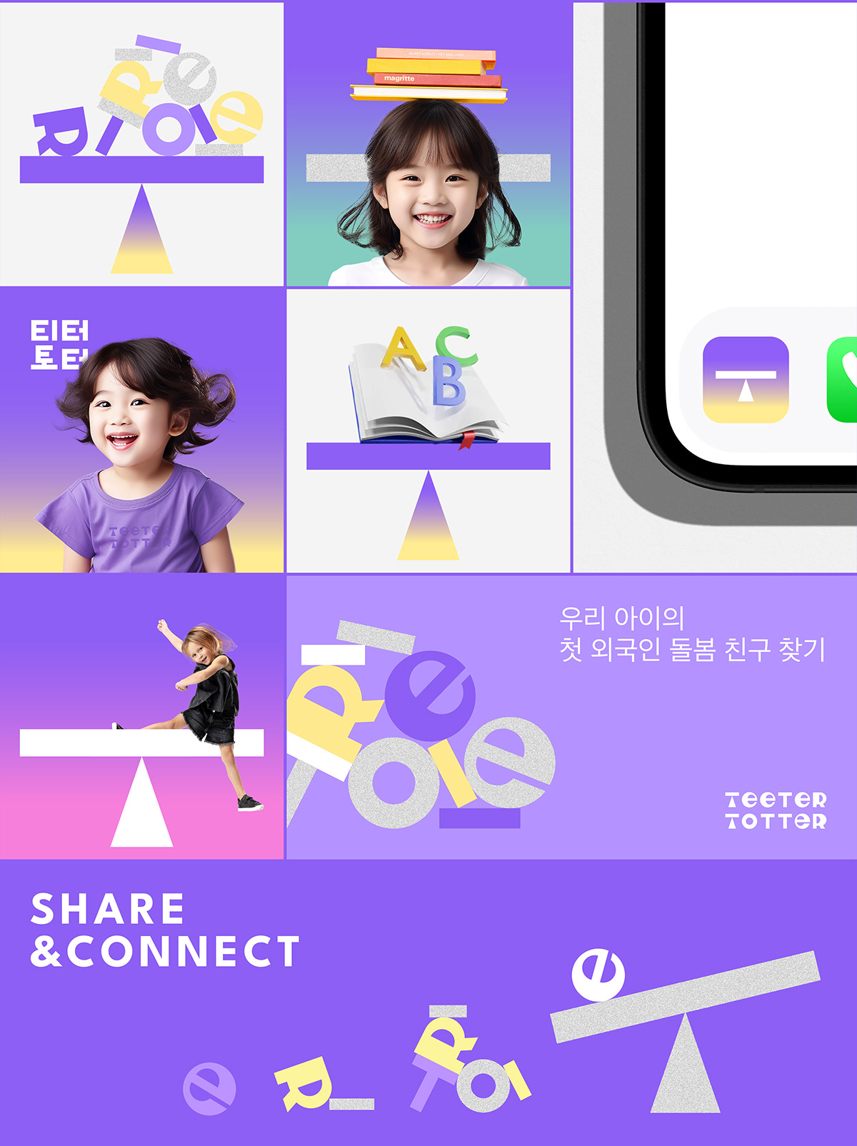
A new chapter of childcare, TEETER TOTTER Brand Identity Project.
INFORMATION:
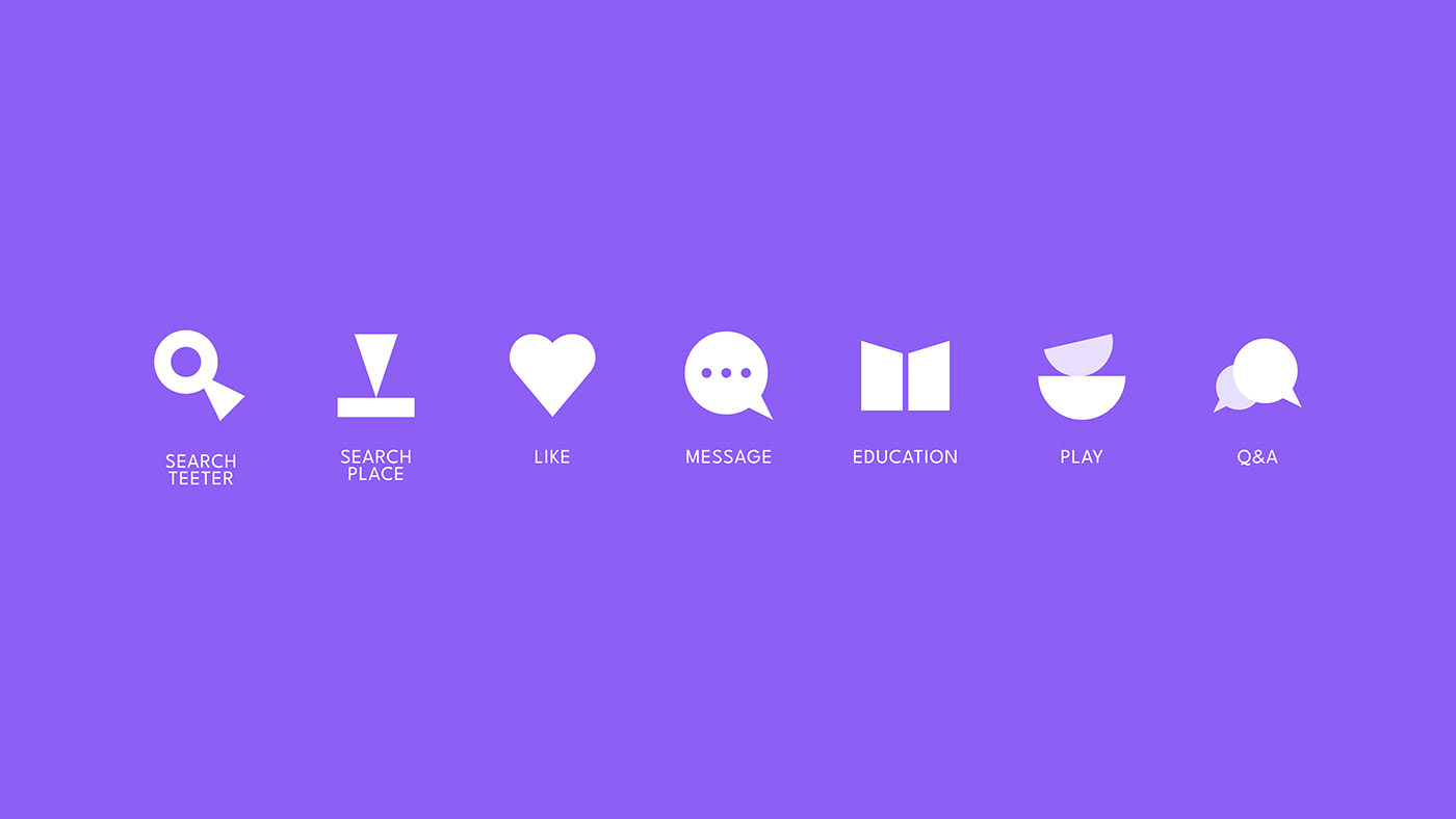
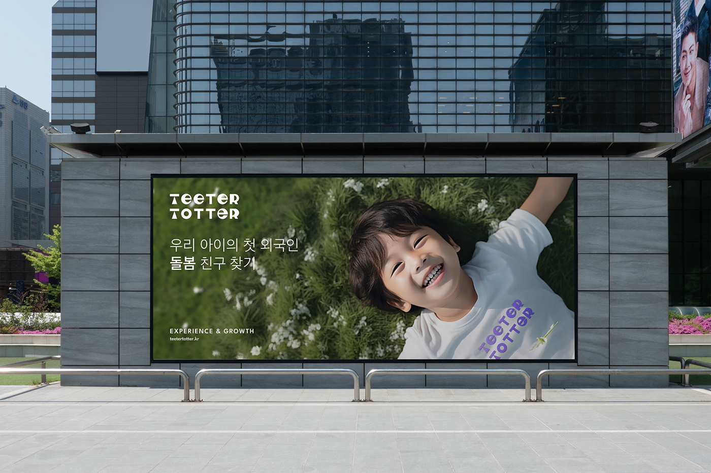
This service is designed to offer tangible assistance to parents juggling work and child-rearing activities. It allows you and your child to encounter diverse cultures through meeting teeters from around the world, providing a chance for children to see language not as a subject of study, but rather as a playful tool for communication within daily life. Additionally, it offers foreigners living in Korea an opportunity to introduce Korean culture.
Project Team:
WW -Worth it & Worthy CBO, Creative Director : Bohyun June Kook
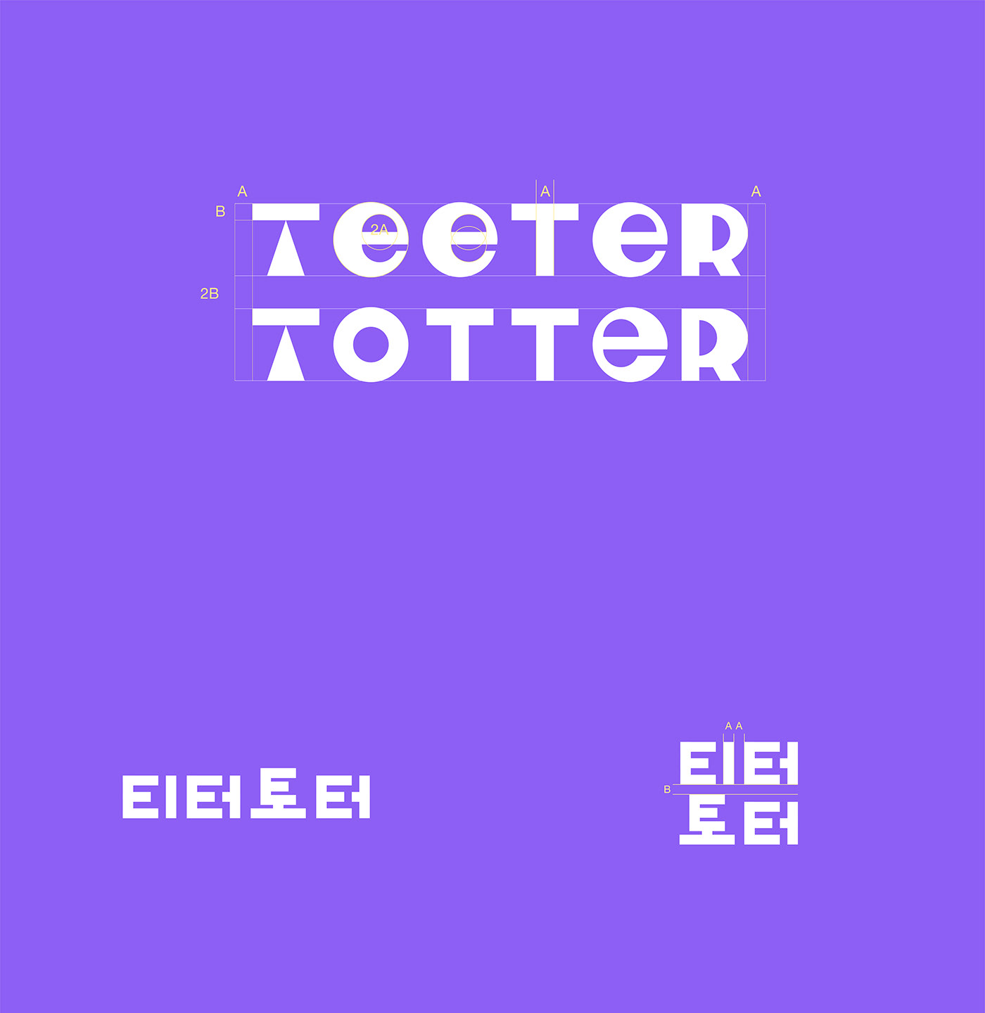
BE BASED ON BRAND
Design director, BX Design : Kahyun Kim
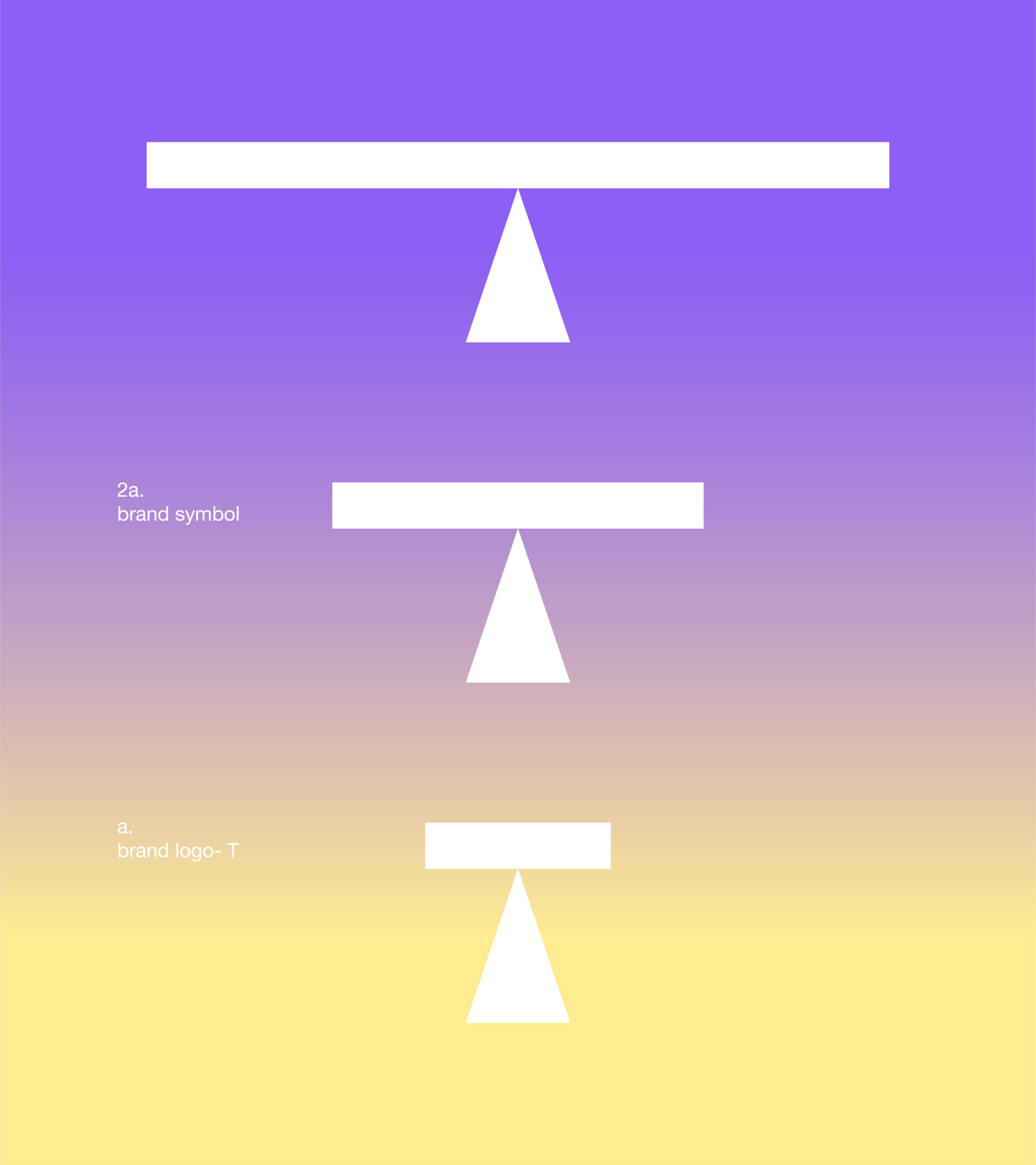
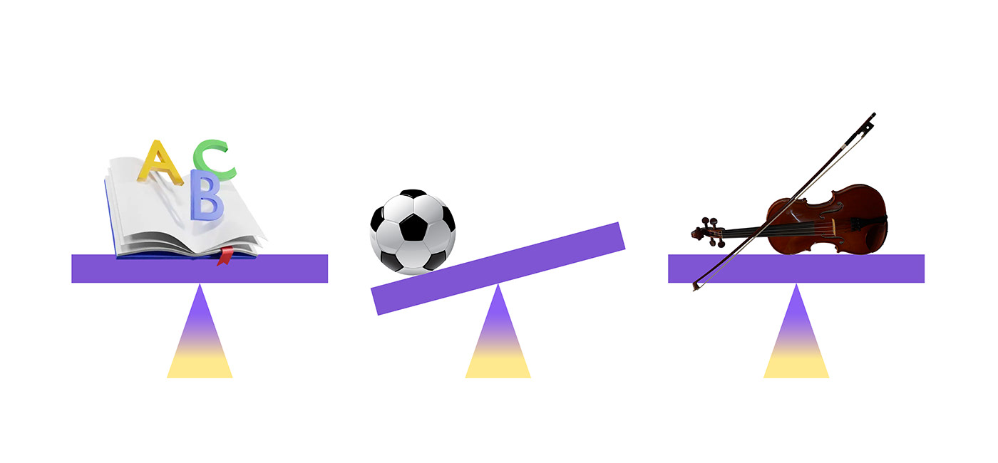
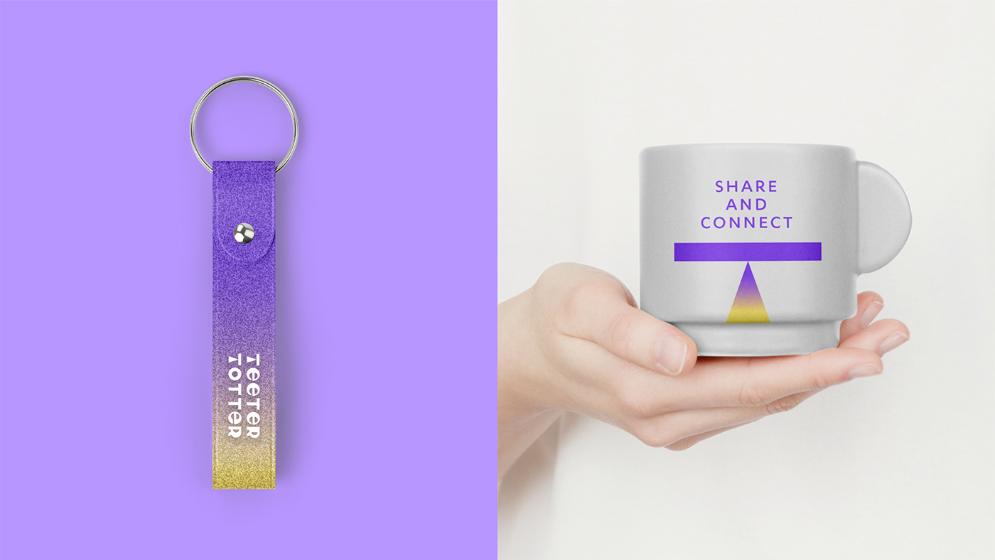
“Even a small weight is essential for finding the final balance, just like a counterbalance. Similarly, TEETER-TOTTER provides practical support for a balanced life, preventing your daily routine from being overly tilted towards parenting alone. Through meetings with foreign caregiving friends, our children are given the chance to encounter English in new and exciting ways, while parents can find a little more breathing space in their daily lives.
The counterbalance of life, that’s TEETER-TOTTER for you.”